Infographics are one of the top tools that always engages your audience and it never gets old.
Table of Contents
Togglewe will walk you through the following:
- what is the infographic?
- are infographic design and data visualization the same?
- 7 types of infographics.

What is the infographic?
From its name, information + graphic = infographic
Let us explain more. Infographics is a demonstration of some information in a graphic way designed to turn the tough information into a simple and fun one.
Do you remember back in school or college, when we used to create mind maps, and highlight the important parts, so that we can learn better and remember them later in the exam?
It’s the same with infographics, except there are no exams waiting for us. So why don’t you make it easier for your audience and start creating infographics?

Are infographic design and data visualization the same?
Infographics focus on facts, events, or numbers. They also narrate a story that leads the reader to take a specific action, and of course, they used for content marketing and blog posts. On the other hand, data visualization focuses on data with no agenda. That makes the image clearer for the audience. So that they could easily decide.
7 types of infographics:
1. Timeline infographic:
It’s used for representing the history, or put the spotlight on critical dates.
2. List infographic:
It’s used for making your content organized by using icons, creative fonts, and colors, instead of boring bullet points and boring ordinary fonts. They appeal to the eyes and make it fun to read dull information.
3. Statistical infographic:
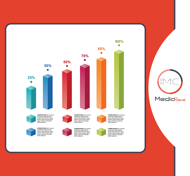
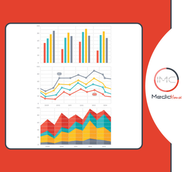
It’s used for representing data like survey results, and statistics.
4. Resume infographic:
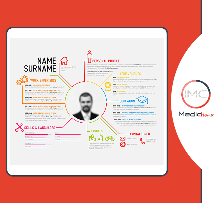
Who doesn’t need a resume? A non-existing human maybe? Everyone must have their own resumes. The resume infographic is eye-catchy and gives your resume a simple look so that the employer will not get confused while reading your resume.
5. Comparison infographic:
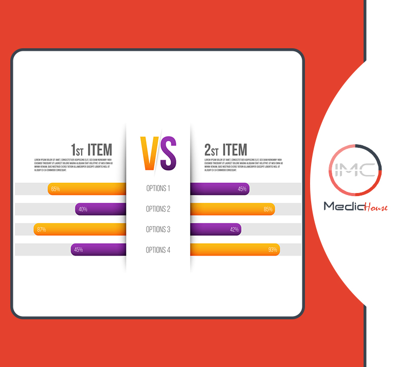
It’s used to help people make the right decisions by splitting the page into two sections to compare two items.
6. Hierarchical infographic:
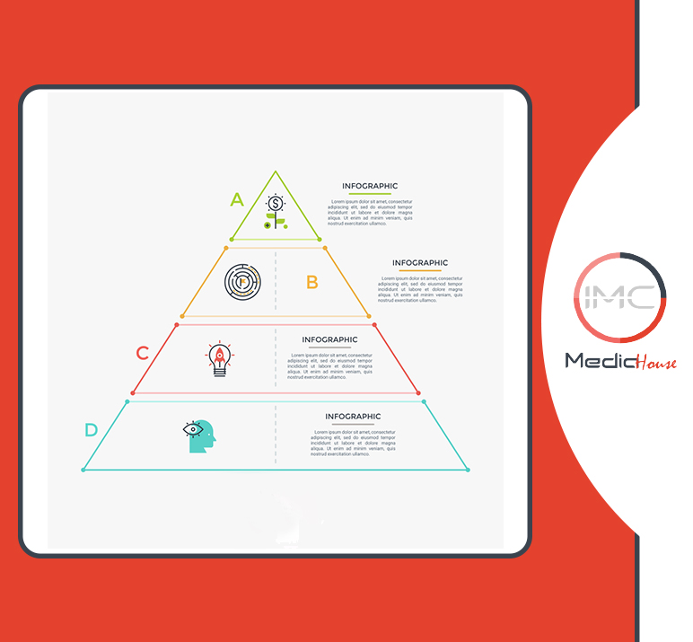
The easiest way to make it clear is to make it simple in a pyramid shape.
7. Process infographic:
It’s used for paraphrasing the steps of any procedures, and turn them from being complex into simple ones.
In a nutshell, an infographic is a fun, creative demonstration that generates simple information out a complex one. Now, which type are you going to use?