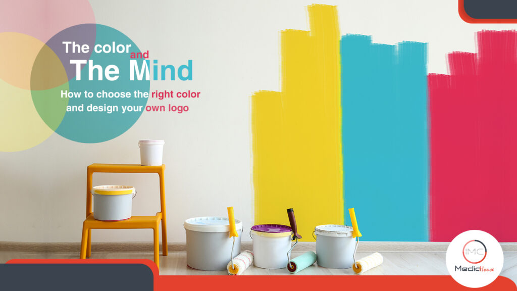
In this article, we will talk about how to choose the right color and design your own logo like the top companies in the world
How to choose the right color and your logo design?
Let’s play a game? We will mention a few brands, and you will focus on what comes to your mind first. Okay!
KFC, Pepsi, Facebook, and Google. So what was the first thing to come across your mind? Logos, right? Do you know why? Because logos are the first thing we see when we eat KFC, drink Pepsi, open Facebook, or search on Google.That’s why you should know that a great logo and the brand it represents are two faces of one coin. Think about famous brands such as Pepsi or KFC. Their logos are perceptible shorthand for the business itself.
So what’s a logo?
It’s a symbol used to speak for a brand. Many logos have a hidden meaning. It might be something that is related to the story behind the company or an awesome visual pun. If you want to tell a story, so branding is your call. It’s how humans communicate.
So what’s the main ingredient that creates the story of a logo?
It’s a symbol used to speak for a brand. Many logos have a hidden meaning. It might be something that is related to the story behind the company or an awesome visual pun. If you want to tell a story, so branding is your call. It’s how humans communicate.
The color for sure
You can say what you want to say using the right color. For known brands, a color can be linked to the business’s identity. Take a moment and think of Facebook famous blue logo or Android’s green logo. For new brands, their logo color is a trial to position their business with their customers.
In this article, we will focus on how famous brands use color in their logos. People create logos because visual recall is a strong weapon. In addition, they enhance it using the right color.
Logo color and brand identity
If the brand name and color are chosen carefully, that will contribute to brand perception, and communicate the wanted image. The reason behind that is the powerful link between color and brand identity.
In Lauren Labrecque and George Milne’s research, they found that red color is 60% of retail brands, and 0% of apparel logos. On the other hand, blue is used in 75% of credit card brand logos, and 20% of fast food brand logos
Global 500 corporations worldwide and logo colors
Looking at the logos of Global 500 companies, you can notice one well-known trend. The most popular choice of logo color for these companies is blue. Blue is an unoffending color, a safe but sophisticated shade. Companies who want to convey security such as finance or health, blue is the key.
On the other hand, red is a more of a daring choice for a brand. It is the second-most popular choice. When you visualize food and retail industries, red logos come into your head.
Color psychology and logos
So what’s the reason behind all of this?
It’s color psychology. It’s all about the relationship between specific colors, or shades and human responses. Researchers and marketers have analyzed human responses to colors. But none of these are the same. One person might link red with exciting color; other person might link it with blood. There are some elements, which should be taken into consideration when it comes to colors. They are context, culture, gender, and mentalities.
Choosing the wrong color might ruin your marketing plans. On the other hand, there isn’t a color that will automatically guarantee success for you brand. You need to do some efforts.
However, there are some powerful links with specific colors in the mind of consumers. The link between red and excitement might not be inherent to the color itself, but it could be a result of the fact that it’s often used by brands who want to pass on this message. Consumers see this color and find out subconsciously, that there is a subtle message being passed on.
Logo trends
Many brands tend to update their logos every five years or more. They have to keep up with time. This allows them to stay on the top, and also staying true to their core brand identity. If you’re going to create your logo, you should think about your business goals. Shoot for something that makes sense and connects to humans.
It’s time to create your own logo
1- Industry research:
It’s all about answering some questions such as, what’s the goal behind this business? Who is the target audience? How is it going to convey the message? Think about your ideal customer. And the competition you are in. your brand strategy will help you with that.
2- Choose your logo type:
Wordmarks and symbols are two types of logo. A wordmark is where the name of the company is under the spotlight. This type depends on a good typeface and strong color choice. On the other hand, a symbol logo depends on icons and images to make the brand perceptible.
3- Choose your color scheme:
What do you want your logo to be linked with? What is the first thing that would pop up on the minds of the customers when they see your logo? Which color would convey your message?
The colors that you will choose are going to be used more than you think. They might be on your website, flyers, etc.
Now after knowing all of this, are you still confident about your logo? Do you want to change something concerning the color? If so, contact us to help you.